
Sunday, April 29, 2012
Sunday, April 22, 2012


Sunday, April 15, 2012
Value Assignment

This assignment was interesting. At first I thought it would be easy but I found it to be a bit harder than I had anticipated.
Sunday, April 8, 2012
Illusion
Illusionistic Space


This image uses aerial perspective to get a sense of depth. As the stairs go to the next floor it makes the ceiling seem further away.

This image uses size to give it depth. The art on the left is a bit larger than the one on the right, while the one on the right is larger than the one in the center.

The shadow is an example of exaggerated size to give the image a sense of depth.
Illusionistic Motion

The cropped image gives the dog a sense of motion.

The use of repeating images gives it a sense of motion; the cards moving from one hand to the other.

This image uses blurred lines to give it movement.
Wednesday, April 4, 2012


Sunday, March 18, 2012


Sunday, March 4, 2012
Rhythm
 |
| Bumpy |
 |
| Collision |
 |
| Slimy |
 |
| Smooth |

Sunday, February 26, 2012
Balance


Monday, February 20, 2012

Sunday, February 12, 2012
Emphasis and Focal Points

This image demonstrates emphasis of one-element. Although the swimmer might be considered the focal point, I believe it's the cityscape. I say this because the wording above the image attracts your eye more than the swimmer. Found on Bing.


This image represents emphasis by contrast, because the rest of the faces are yellow and they have smiles while the red one has a sad face. Found on Bing.


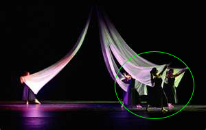
This image has an emphasis on isolation. The dancers to the right seem to be the focal point, while the single dancer to the left is isolated from the group numerically and with a bright light. Found on Bing.

This image demonstrates emphasis by placement. The fire-hydrant is the focal point because when you look at the hydrant your eyes move to the tree then to the building and eventually to the yellow post and back to the hydrant. Found on Bing.


This image has no focal point. It is almost like splatter paint.
Sunday, February 5, 2012
Unity Assignment


Friday, January 27, 2012
2D Ideal

My ideal design is something that has balance in both its colors and its layout. I took this photo for my photography class last semester and captured my ideal design. The balance between dark and bright colors, makes this photo interesting. In the photo, the foreground and the background equal each other and balance out the intent of the photo.
Subscribe to:
Comments (Atom)